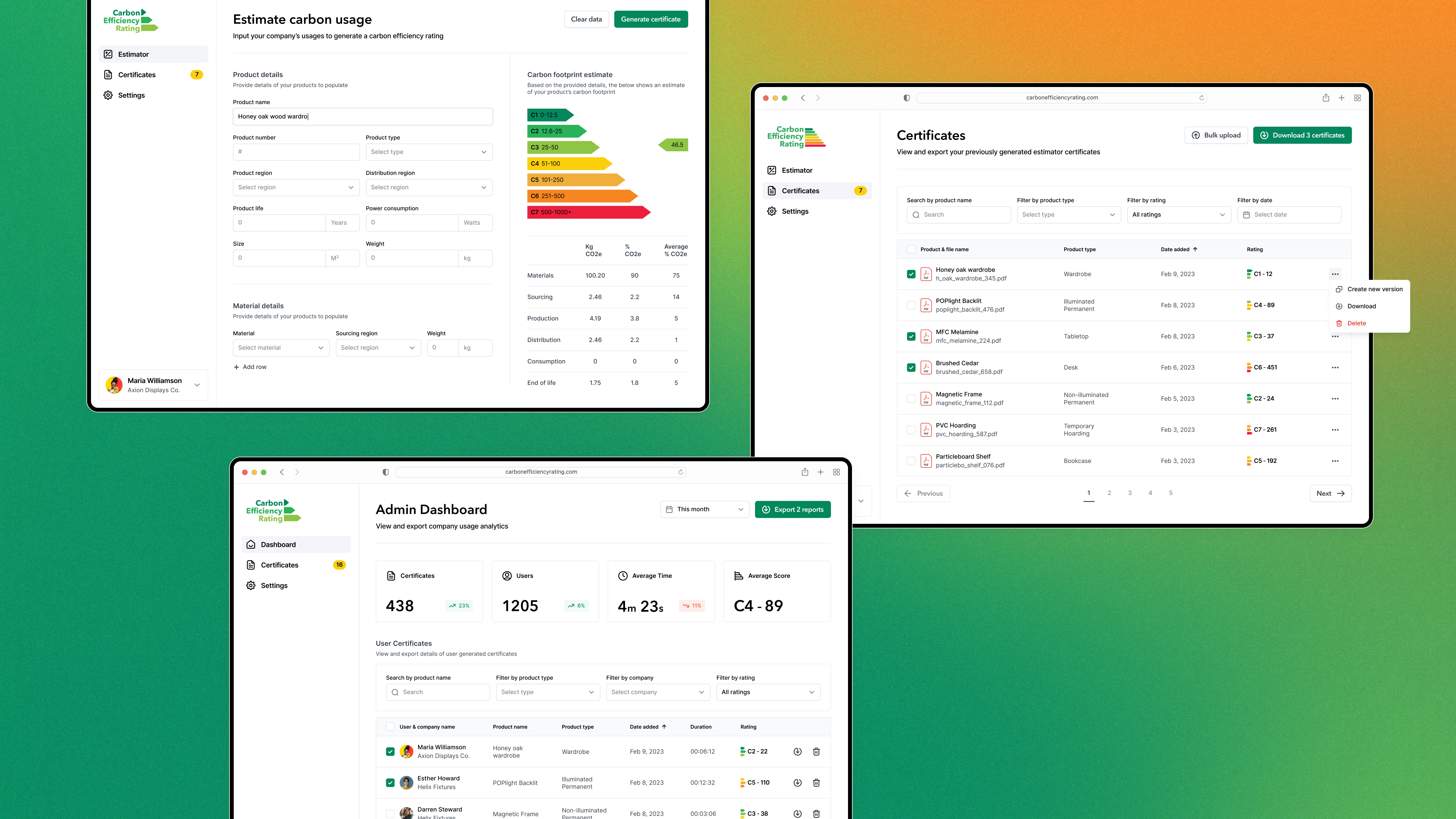
Carbon Efficiency Rating is a web application for furniture manufacturing companies to efficiently calculate and generate PDF certificates which score the carbon footprint of their products. The app helps to empower businesses to track their environmental impact and drive positive change within their industry.
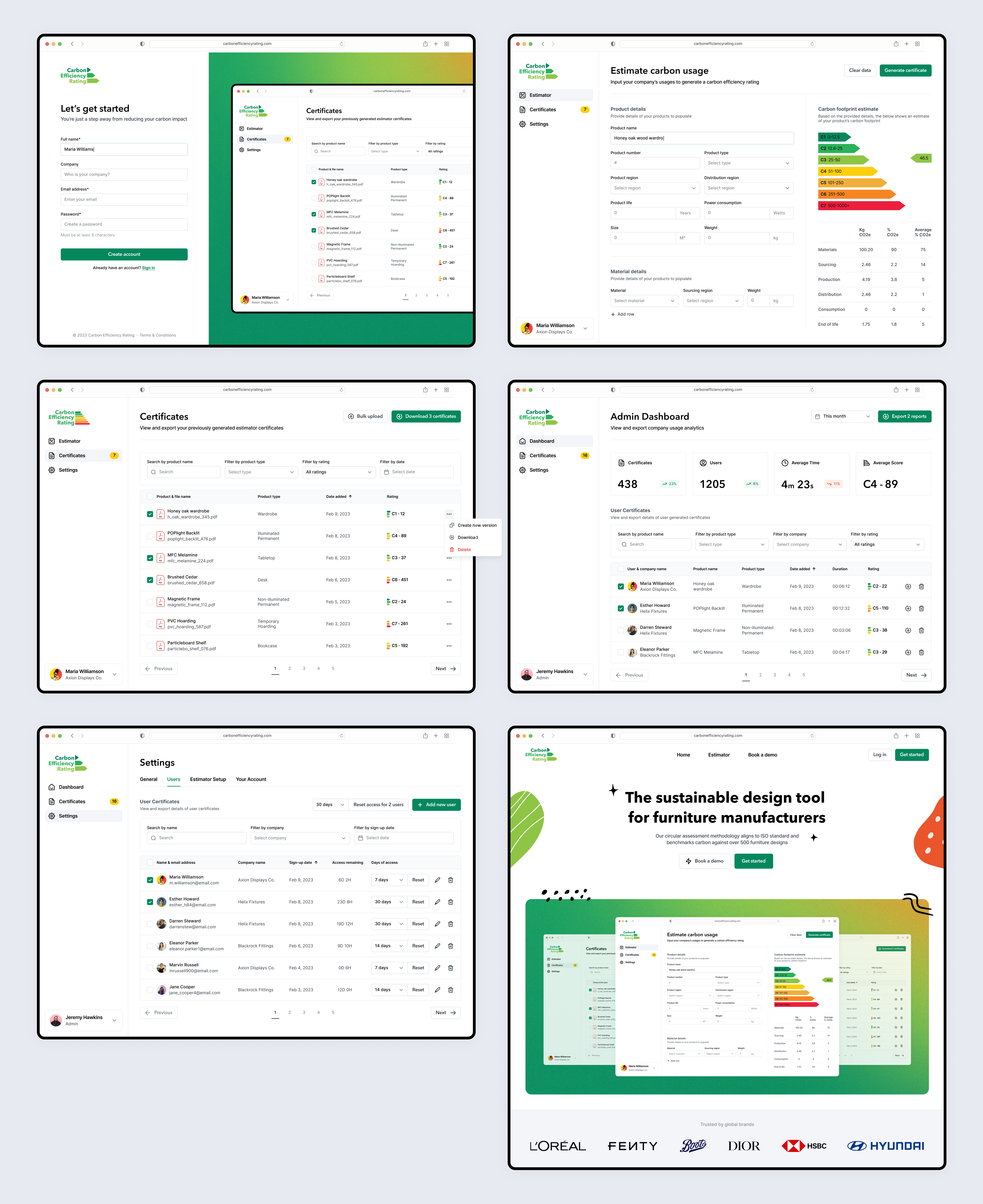
Commissioned by a startup company, this project involved the creation of a number of key high-fidelity screens and a website landing page.
The problem
With limited budget and time for delivery, these designs were intended to serve as a foundation to influence the application’s subsequent pages, the user experience, and the overall branding identity.
The brief provided was rather imprecise and required interpretation on my part. For example, the requirements were simply: a set of 3 screens (an input form to collect product details, an index of reports, and an Admin dashboard) and the clear objective to allow customers to generate reports that provide oversight into the carbon footprint of their products and the manufacturing process.
The solution
Given the restriction in number of screens and their influence on the rest of the application, it was imperative that they form a strong foundation that can be expanded upon in future. For this reason, I was influenced by Untitled UI’s design system, given that its 10,000+ Atomic components covered a vast array of design elements. Considerations were also made for components that would likely be added to in future, for example the main navigation menu and tabular settings pages.
In terms of the app’s functionality, I identified the main flow for new users needing to add details of their entire product stock as a potentially major pain point. The action of adding a new product, whilst simple and concise, would no doubt become time consuming and monotonous for those with a larger product library - for this reason I added a ‘Copy product’ feature to create new reports from a previously-added certificate, along with a ‘Bulk upload’ via CSV option for more advanced users, vastly trimming down the time required to fulfil this task.
Finally, since branding had not yet been established, I conducted research on current trends, particularly for the landing page, on sites like Dribbble and Behance. I found inspiration in the current trend of hand-drawn doodles, which contrasted nicely with the clean, rigid/square inputs and tables throughout the app. The doodles leaned into the natural/biological style (given the materials used by customers’ businesses) and added some much-needed vibrance to help liven up a relatively dry subject.
Due to the aforementioned restrictions with the budget and delivery date for the initial MVP, I was unable to explore all the ideas I had. However, had this not been the case, I wanted to lean into the almost 'gamified' aspect of generating and comparing certificates. The idea was to have an interim stage after generation that, using motion design and Apple Watch fitness-style gauges, would calculate the overall score and rank of the product, with a comparison to an overall leaderboard. This flow was intended to place heavier emphasis on the goal of reducing each manufacturers’ impact on the current/future global climate.
Currently, the application and website are in development, and once complete, I will add the links here.

